
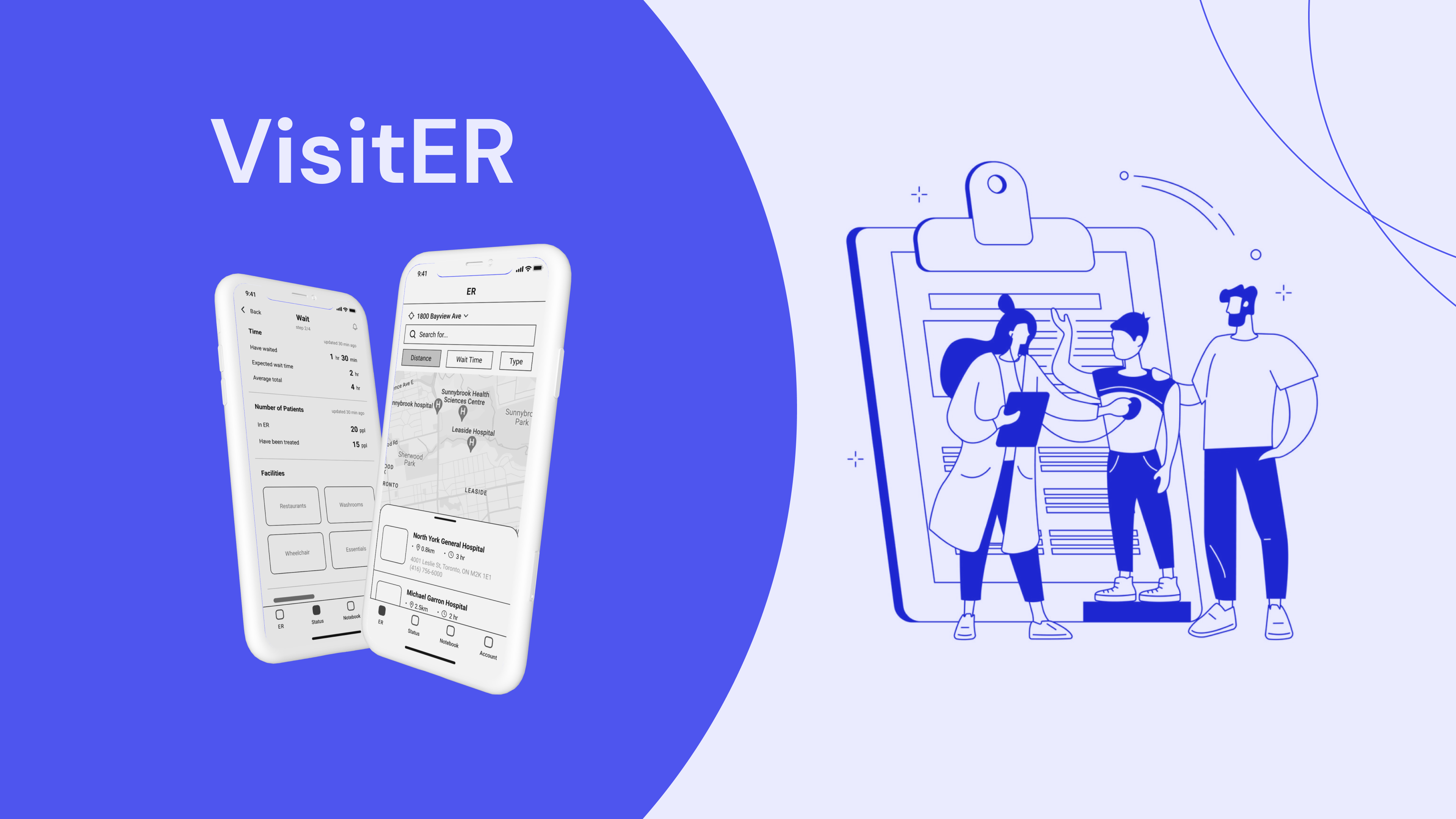
VisitER
[App Design | UX Design Project]
My Role
Research, Ideation, Low-Fi Sketches and Mid-Fi Wireframes, Evaluation
Tool Used
Figma
Team
😎Hao Wu, 😊Shuyi Zhang, 😁Francesca Cheng
Skill developed
Research, User interview, Wireframes, Project management, Teamwork
Sector
This project was focused on the Healthcare sector
Client
This project is the Fundamental UX Design course at the University of Toronto Master's level.
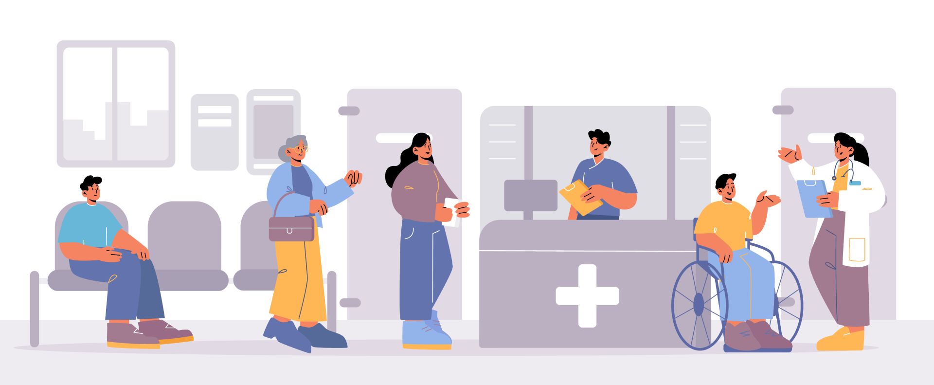
THE PROBLEM
ER Visit Experience
Emergency Departments (EDs) across various healthcare facilities often present a challenging experience for patients, characterized by feelings of helplessness and anxiety, further aggravated by long waits and overcrowding. Challenges in communication with healthcare staff and unreliable wait-time data add to the confusion, making it hard for patients to decide on visiting an ED, choosing the right one, and managing their wait effectively.
To gain a deeper understanding of these issues, we have engaged in both primary and secondary research within this problem space.

DEFINE
How we can help improve this situation?
Understand our users
To obtain data from a representative sample of users for our primary research, we employed a combination of interviews and questionnaires. An in-depth investigation of the participants' experiences, perspectives, and emotions is possible through interviews. Surveys are an excellent approach to get objective, organized, quantitative data for trendy analysis.
Primary Research Findings
Our primary research revealed that patients and caregivers, fully aware of the limitations in enhancing any hospital resources or facilities, exhibit significant patience and respect towards the current healthcare system. They desire a healthcare experience where they feel seen, heard, informed, and comforted. Based on the primary research, we determined that the current ER visit experience needs to be improved and redefined from one of dread to one of dignity, empathy, and respect.
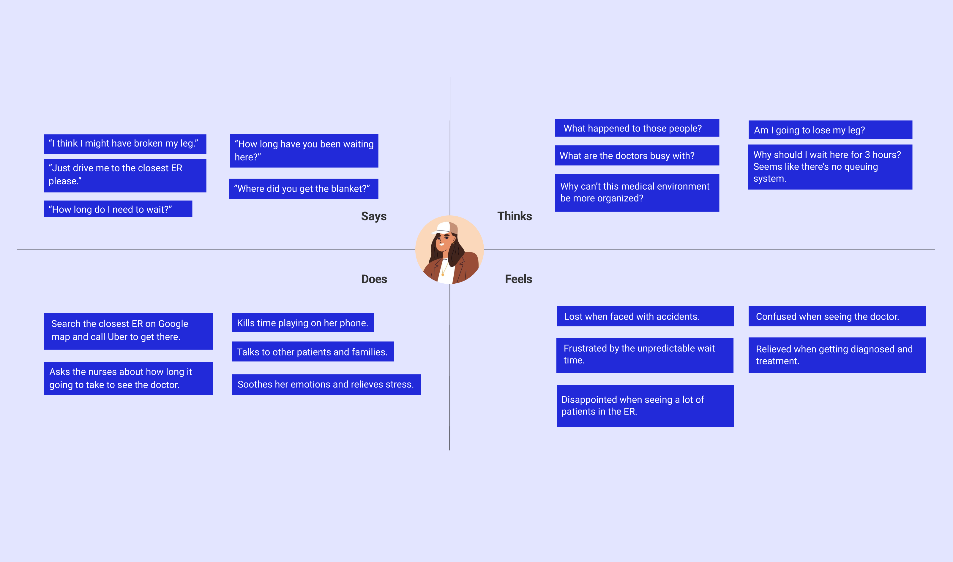
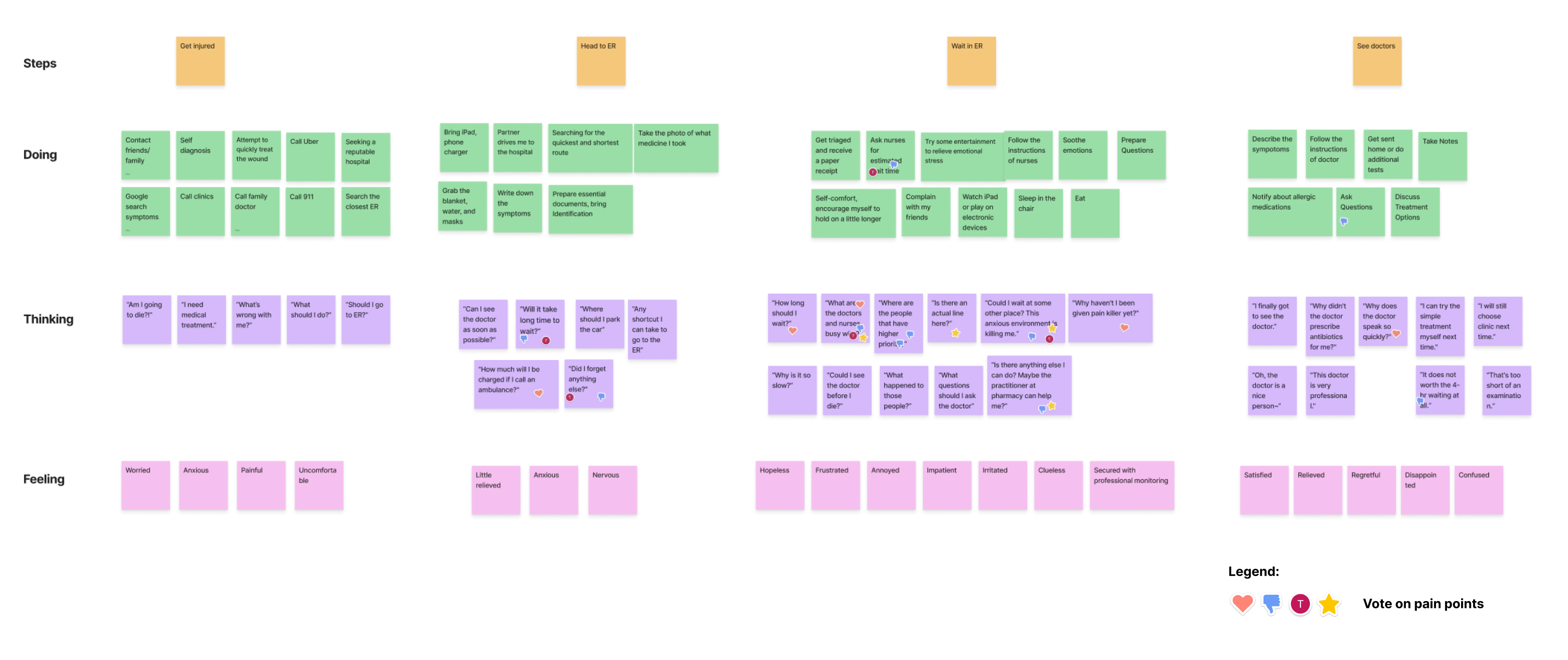
Persona and Empathy Map
To better understand ER visit journey, we created a user persona and an empathy map for Sally .
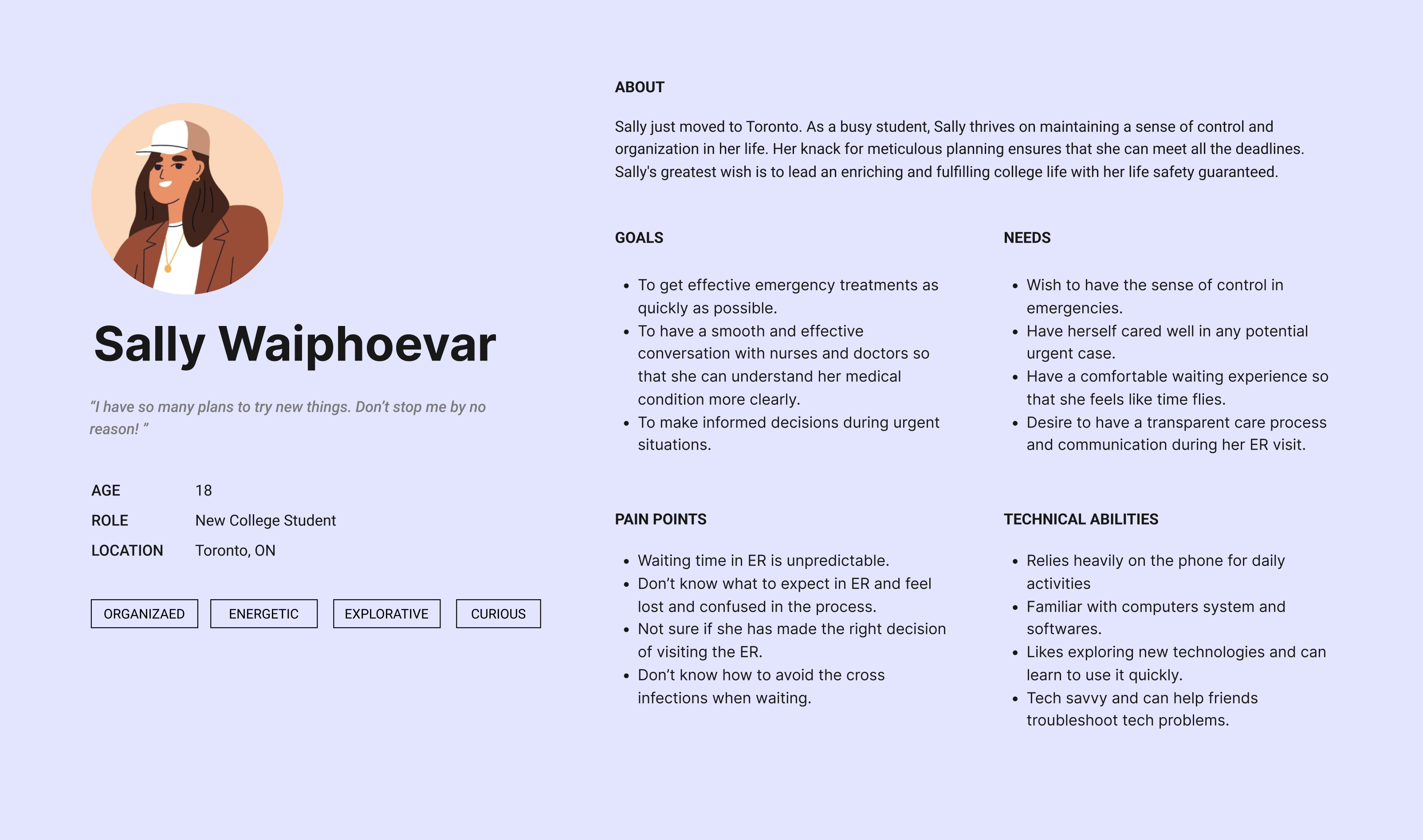
The major pain points Sally experienced in her current ER journey include
🤯 Utopian expectations about wait time that don't match reality;
🥱 Blindly long wait, where she feels clueless about the current situation;
🤕 Anxious and helpless when she can’t get any emotional support;
📝 Lack of preparation before seeing the doctor and hearing the medical terms.
Current User Journey + Pain Points Voting
After analyzing the current situation of visiting an ER, we have summarized Sally’s critical pain points based on which we get her crucial needs that require to be met to relieve the pain. Through grouping and simplifying all the needs, we get our focus on the 5 main needs statements to generate ideas along the ideation process.
- Sally needs a way to make informed decisions of selecting among ERs so that she will feel secure by familiarity and confidence.
- Sally needs a way to prepare what to bring and what information to provide for the assessment so that she would have a comfortable and smooth experience.
- Sally needs a way to learn and understand her conditions or symptoms so that she could be less stressed about her medical situation.
- Sally needs a way to get informed about her waiting status so that she will adjust her expectations accordingly and doesn’t feel frustrated or lost.
- Sally needs a way to receive emotional support so that she feels more secure and at ease during the wait.
Design Objective
With all of these critical frustrations and the industrial limitations of healthcare resource shortage in mind, we will focus on bridging the information gap and emotional support for a better ER visit of dignity, empathy, and respect.
IDEATION
Assumption
- Hospitals will be willing to share the information (step progress) for patients to view
- We can get the wait time from the healthcare industry and update them in time
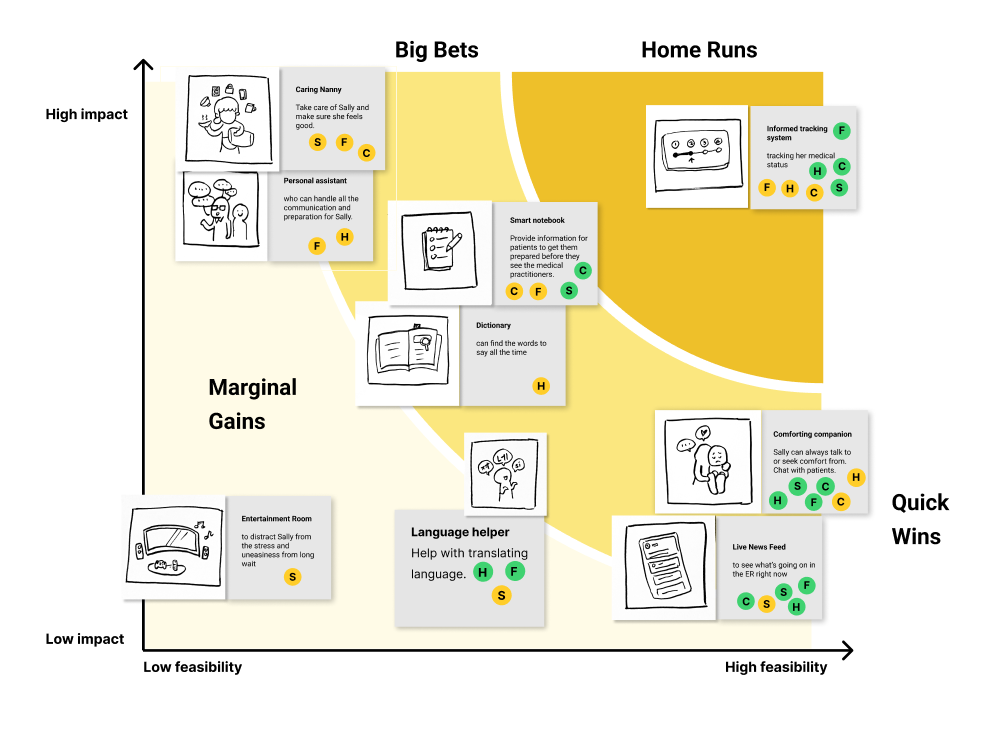
Big idea-voted
To narrow down the focus, we clustered the ideas into nine groups and voted on the feasibility and impact for alignment. Thus, we get a solid base on which we can prioritize the practical and meaningful tasks to cost-effectively improve the current situation of visiting an ER.

Prioritizing Grid
After mapping the clustered and voted ideas on the prioritization grid, we have “informed tracking system” as the home run, “comforting companion” and “live news feed” as quick wins, “smart notebook” group as big bet, and “caring nanny” group and “entertaining room” as marginal gains. Within these options, we determine to go with the home run, quick win, and big bet, which are the “informed tracking system”, “comforting companion”, “live news feed”, and “smart notebook” respectively.
PACT Analysis
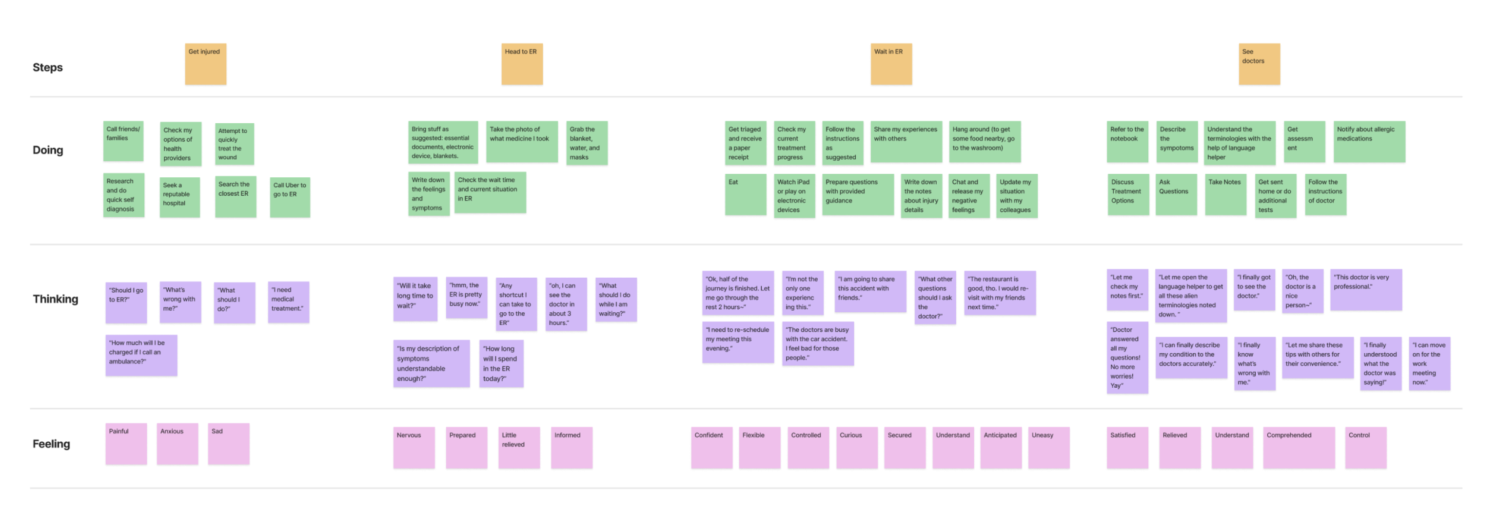
Future User Journey
With the critical needs met by the big ideas, we explored how the situation will be improved through the to-be scenario.
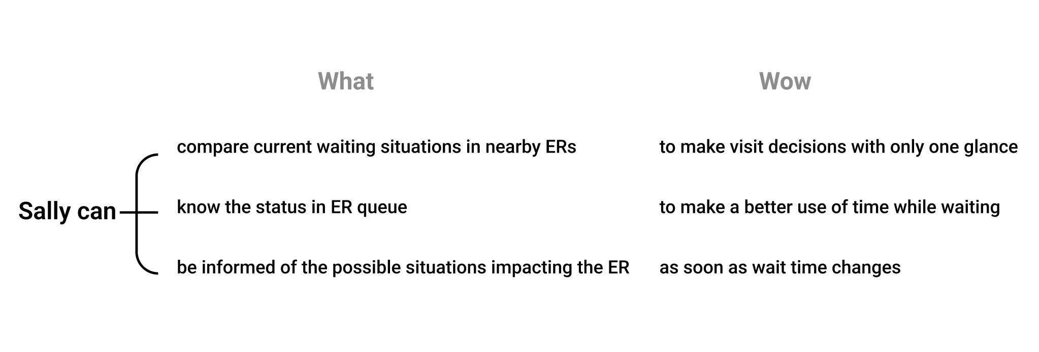
Our design goals
After narrowing down our big ideas based on the impact on user experience and social value, and the feasibility from the technical perspective, we have set up our hill statements as the guideline for our solution design and the envisioned future we are aiming to achieve. Centering around the biggest pain point of blind wait, we craft the three statements about easy ER selection, status in ER queue, and the notifications on wait status.
DELIVER
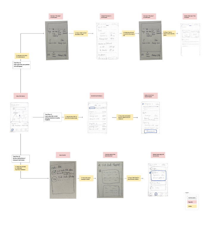
Low - Fidelity Wireframes + Task Flow
Low-fi wireframe that is created by paper sketches for lean evaluation and revision. Three tasks flows have been involved to fulfill our objectives of relieving patients’ stress about blind wait, which are learning about current waiting situations of available ERs nearby, checking the wait status, and getting notified about possible impactors that may change her status in the ER queue.
Lean evaluation
To test the usability of our low-fi paper prototype, we invited three representative users who are 18-30 years old to perform a lean evaluation.
Through the evaluation, we are able to get insights and categorize them on the grid. Largely relying on the group of “things to change” and “new ideas”, we go for the next step of revision around removing panicking news sharing, a detailed list view of ERs, and a vertical progress bar for status displaying,
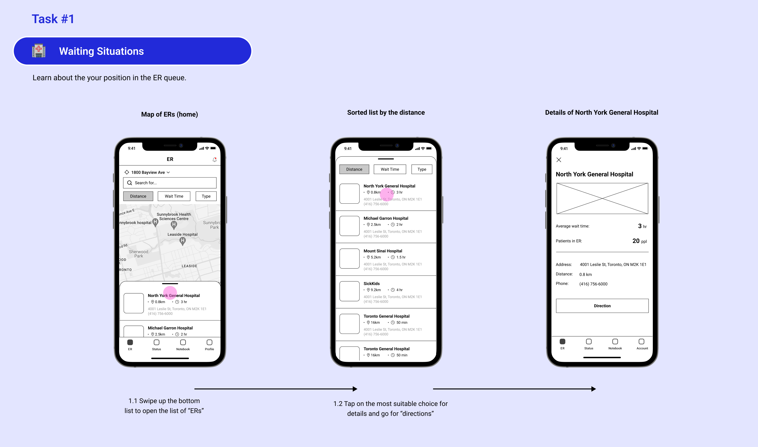
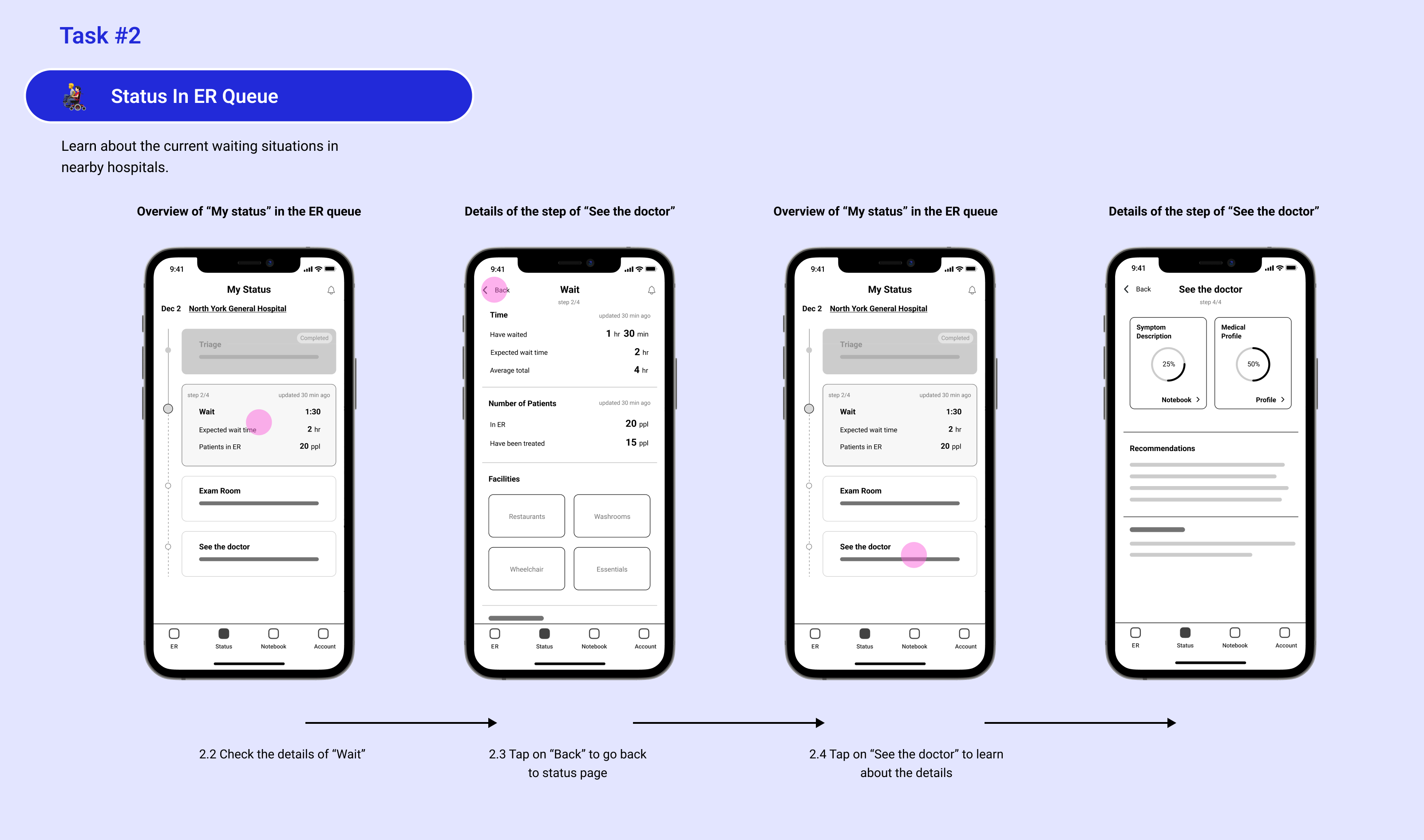
Mid-Fidelity Wireframes
We combined the suggestions from lean evaluation with low-fi wireframes rendered on paper to get the mid-fi wireframe. We changed the horizontal progress bar to vertical to make it more compatible with the mobile screen; News was changed to Notification to avoid panic among patients due to its sensitive nature; Considering the universality of swiping up the bottom sheet for a full list of ERs in IOS systems, we keep this gesture in the design.

Usability Testing
Setting up the evaluation goal to validate our design and gather ideas from the potential users, we have our topic questions crafted around if users can get the knowledge of the surrounding ERs and their position in the ER queue, and the content they expect to see based on their understanding of the screen’s intention. This evaluation will be conducted through observing how users finish the tasks and interviewing them with follow up questions.
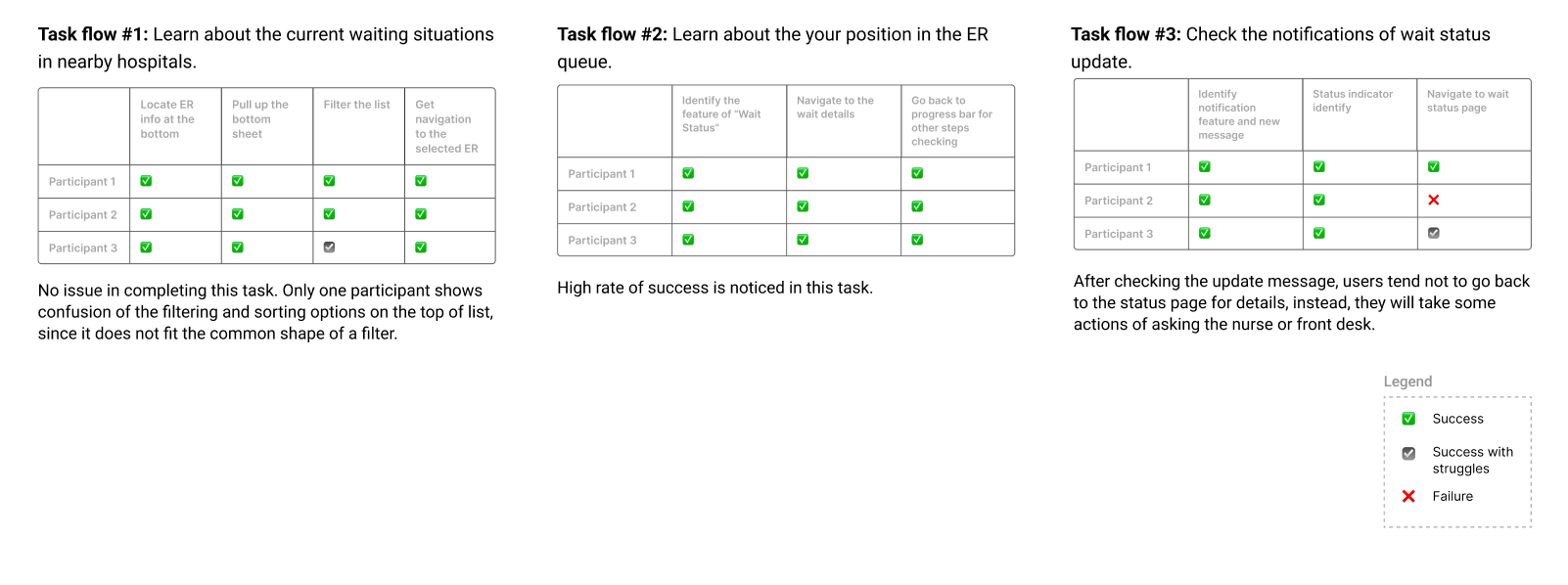
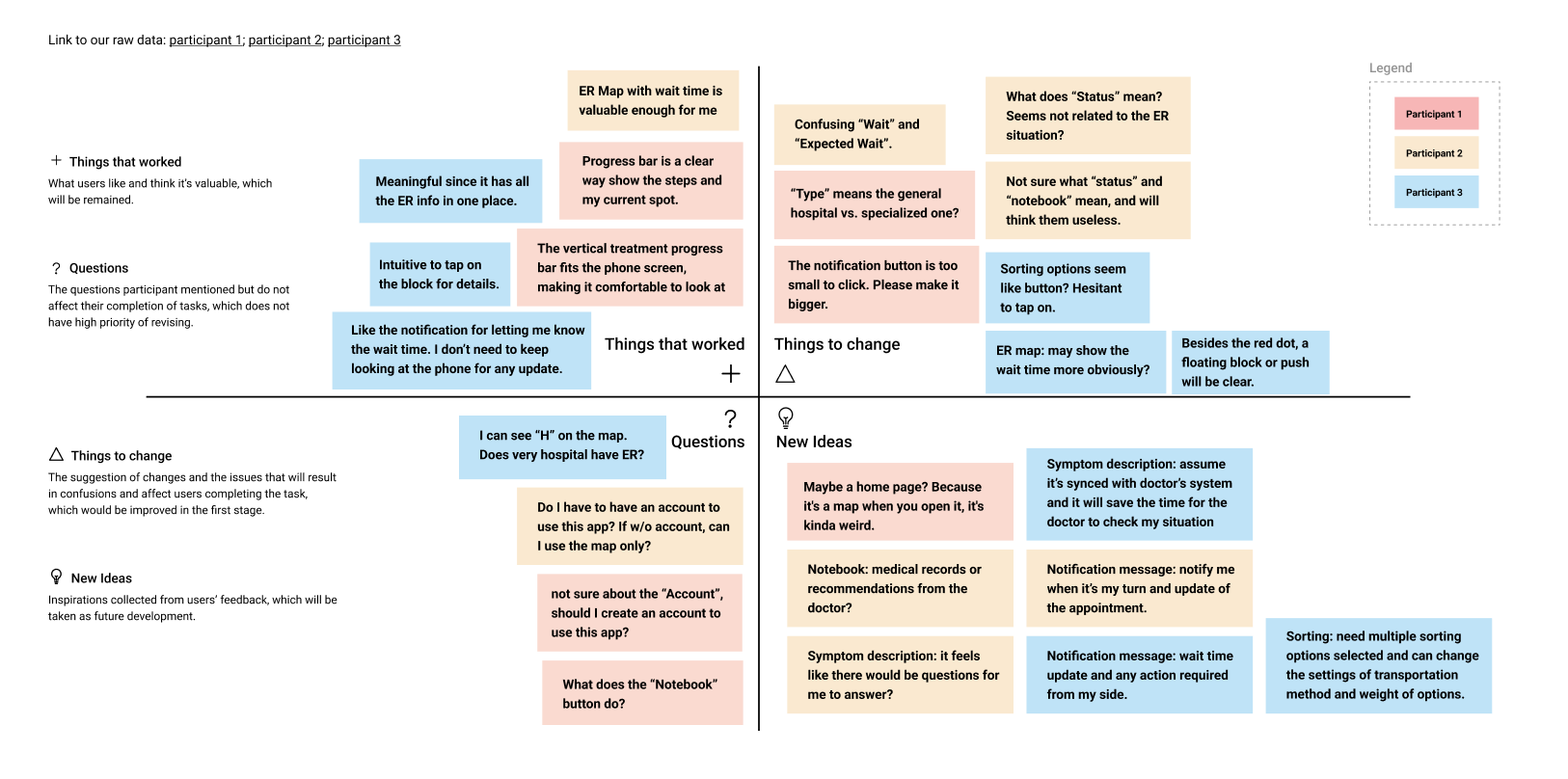
Based on the evaluation analysis, critical issues are highlighted in sections of the “things to change” and “questions”, which will cause confusion and affect users going through the three basic functions to be aware of their wait status. This would mainly include icon size, labeling, and component design, based on which we will revise our design as the first step accordingly. And inspired by the “new ideas”, such as having a notebook synced with the doctor’s system, we will involve new futures while maintaining a solid base of “things that work”.
NEXT STEP
For next steps, we will improve our design based on evaluation findings, conduct another testing for more revision, and take other features of “Notebook” and “Account” into account for further development.
REFLECTION
Addressing the complex problem of ER visit experiences pushed me to think critically and innovatively. It was a challenge to balance user needs with the limitations of the healthcare sector, which improved my problem-solving skills.
If given another opportunity to tackle this project, I would delve deeper into understanding the nuanced constraints of the healthcare system. This would involve engaging more closely with healthcare professionals and possibly observing ER environments firsthand to gain a more holistic view.
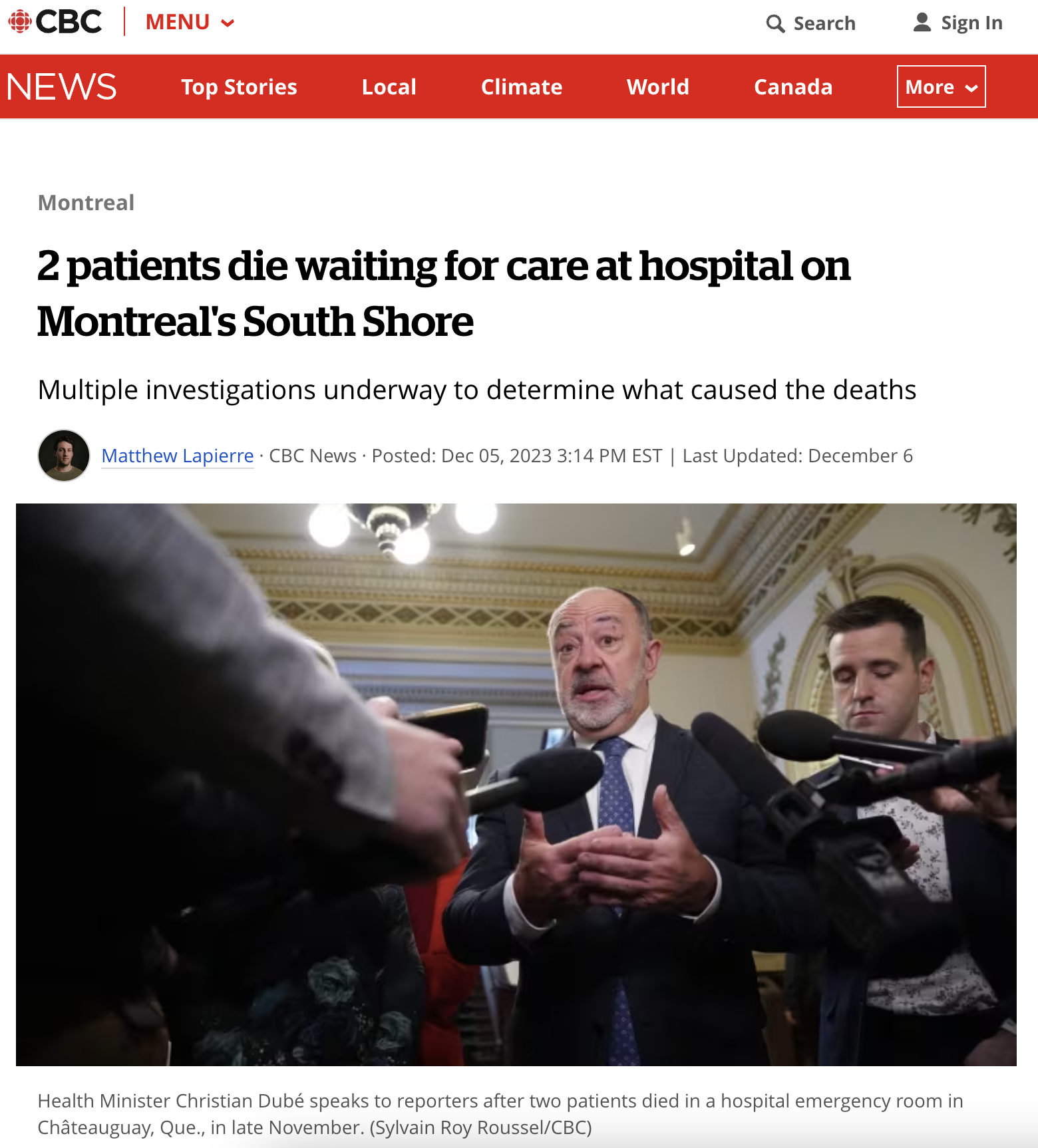
While we were working on this project, a heartbreaking incident occurred, as reported by CBC News: Two patients died waiting for care at Anna-Laberge Hospital. This tragic event deeply resonates with the core of our project and underscores the severity of the challenges faced by emergency rooms in Canada, particularly those operating under extreme overload.
Reflecting on this, it becomes evident that there is a critical need for solutions that can bridge the gap between emergency rooms and patients. The situation at Anna-Laberge Hospital is a stark reminder of the urgency and importance of our project. It reinforces our commitment to developing a solution that not only enhances the ER visit experience but also contributes to a more efficient and patient-centric healthcare system.
Selected Works

TaoBao RebrandBrand design
VolkswagenUI/UX Design
The Crazy OnesType in Motion
International Design AwardsType in Motion
Eat TogetherUI/UX Design
VisitERUX Design
Anti-HypeExperimental Graphic Design
Mi FitMi Fit